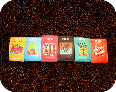

Bold Letters, Bold Roast: How Jackson Alves Designed the Face of Mucho Macho
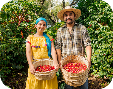
At Dia Café, every bag tells a story — not just of origin, roast, or flavor, but of culture and connection. Mucho Macho, our boldest Latin roast to date, needed a look that could match the intensity and energy inside of the bag. So, we partnered with Brazilian lettering artist Jackson Alves, a talented creative whose work speaks with as much flavor as our coffee.
You’ve probably seen Jackson’s work without realizing it — from art exhibitions in Brazil to branding for international clients, his lettering style is bold, rhythmic, and unmistakably handcrafted. With roots in graphic design and a deep passion for typography, Jackson has spent the past decade shaping letters into stories. When we came calling, he saw more than just a packaging job — he saw a platform to celebrate Latin identity through his artistic craft.
Brewing Up Something Bigger
We first reached out to Jackson in 2022 with a simple idea: collaborate on a special-edition coffee rooted in Latino strength, swagger, and soul. The roast would be called Mucho Macho, and it needed a visual identity as rich and complex as the delicious beans inside. We didn’t want anything trendy or templated. We wanted a custom touch that was hand-crafted, artist-led, and unapologetically loud.
From the moment Jackson opened our email, he was in.
“I remember thinking, this isn’t a typical commercial project,” he said. “You were celebrating Latino artists, and I loved the spirit behind that. It felt real.”
What followed was one of the smoothest collaborations we’ve ever had. Jackson took the creative brief and ran with it — no rounds of revisions needed, no micromanaging. Just pure trust. And it showed in the end result.
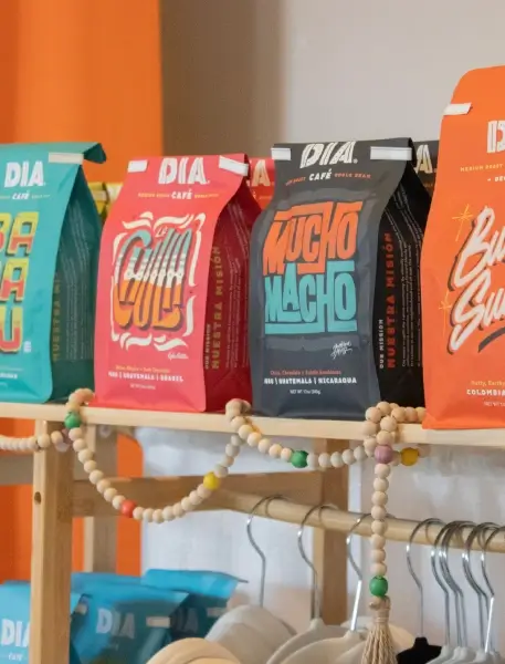
The final design? A type-driven visual explosion that turned heads immediately. Strong yet playful. Bold but with soul. The kind of lettering that could just as easily be tattooed on a bicep as printed on a coffee bag.

Type as Identity
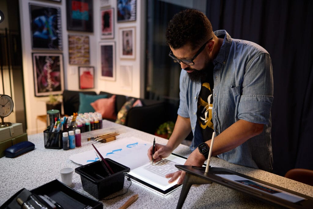
When Jackson designed the Mucho Macho logotype, he wasn’t just thinking aesthetics — he was thinking cultural language. As a Latin American artist, he knows firsthand how powerful design can be in shaping perception and pride.
“Lettering is storytelling,” he says. “It’s identity. So when I was drawing the letters, I was thinking about masculinity, energy, but also heritage. I wanted it to feel familiar and fresh at the same time.”
The typography fuses retro Latin sign painting with contemporary grit — blocky, loud, slightly slanted, and full of rhythm. It doesn’t whisper. It talks back with gusto.
And that’s exactly what we wanted Mucho Macho to be: a roast with an attitude.
From Label to Legacy
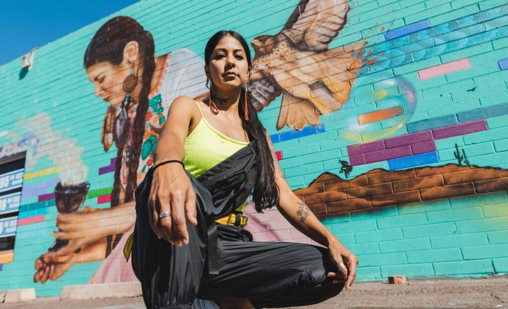
While the original idea was simply to have Jackson design a single label, the collaboration quickly grew into something more meaningful. Two years after the design dropped, we flew Jackson to Phoenix to be part of a Dia Café brand shoot. We wanted to connect his face to the name behind the letters.
“It’s rare to be invited back into a project like that,” he told us. “You didn’t just print the label and move on. You wanted to celebrate the artist, the process, and the story.”
That’s the heart of Dia Café. We don’t just make coffee. We make culture. And that means working with creatives who share that vision — people like Jackson who care deeply about craft, community, and telling stories that matter.
A Creative with a Cause
Even after collaborating on international campaigns, teaching workshops, and building a loyal audience around his art, Jackson remains humble and fiercely independent.
“I always believed that if you just keep showing up — keep drawing, keep posting, keep learning — things happen,” he said. “You don’t need a fancy studio or a big agency. You need commitment.”
That ethos is what drew us to him in the first place. He’s the kind of creative who doesn’t wait to be picked. He draws you in (no pun intended). And in that way, he’s very much like the people we serve: creatives, dreamers, and people who want something more than the status quo.
Mucho Macho, by Design
To this day, Mucho Macho remains one of our most iconic releases — not just for its flavor (which is a whole vibe on its own: dark roast, full-bodied, unapologetically rich), but because of how it looks. It doesn’t sit quietly in the back row. It demands attention.
And that’s Jackson’s magic. He made the bag just as memorable as the brew.
“When someone buys a coffee, they connect with more than just taste,” Jackson says. “They connect with the story, the design, the vibe. That’s what builds loyalty.”
He’s right. And in a world full of beige brands and hollow campaigns, we’re here to do the opposite — to be loud, proud, and deeply rooted in heritage.
The Art of Seizing the Día
Our partnership with Jackson is more than a case study. It’s a blueprint for how we want to work going forward: investing in Latino talent, celebrating craft, and letting artists lead the way.
And while this may have started as a packaging project, it turned into something much deeper — a friendship, a shared mission, and a reminder that the boldest ideas often start with a single sketch.
So next time you crack open a bag of Mucho Macho, take a second to look at the label. Every curve, every corner, every contour was drawn with purpose. With pride. With corazón.
Just like the roast inside.
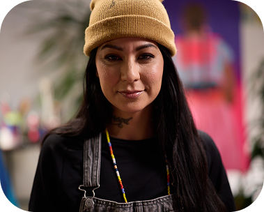
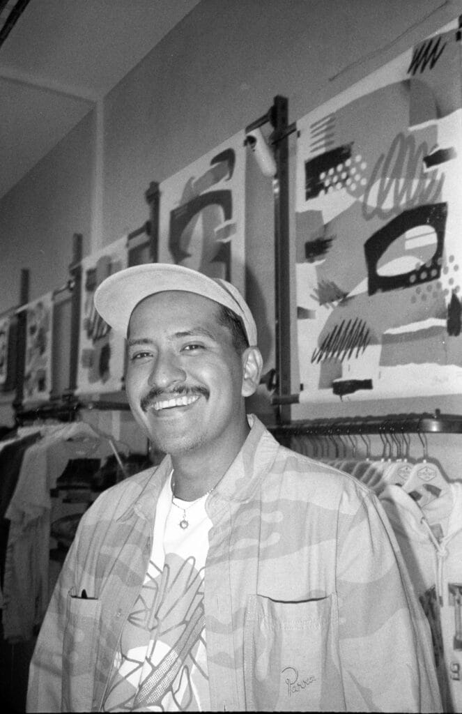
Jackson Alves

https://www.instagram.com/letterjack/
From the streets of Brazil to the sunny beaches of Miami, Jackson Alves has carved his own career path—one elegant curve at a time. Known around the globe for his masterful calligraphy and letterform artistry, Jackson isn’t just a designer; he’s a dreamer, a doer, and a deeply humble creative whose story resonates far beyond the page.

RELATED ARTICLES:

SHOP RECIPE BLEND:

SEIZE THE DIA!
FOLLOW @DIACAFEWI