
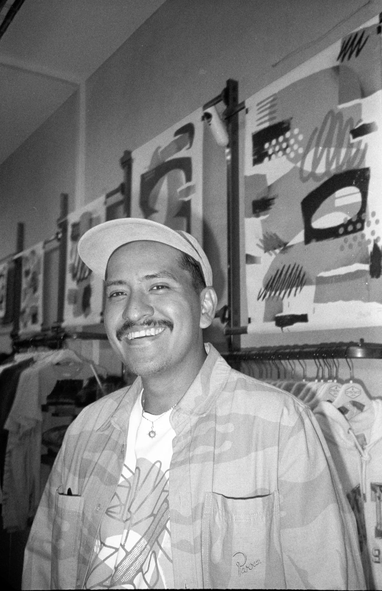
Behind The Artist: Erick Ortega (Calidoso)
A Journey Drawn in Type and Ink
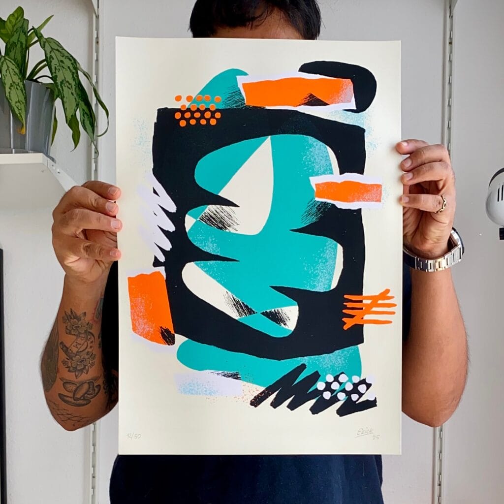
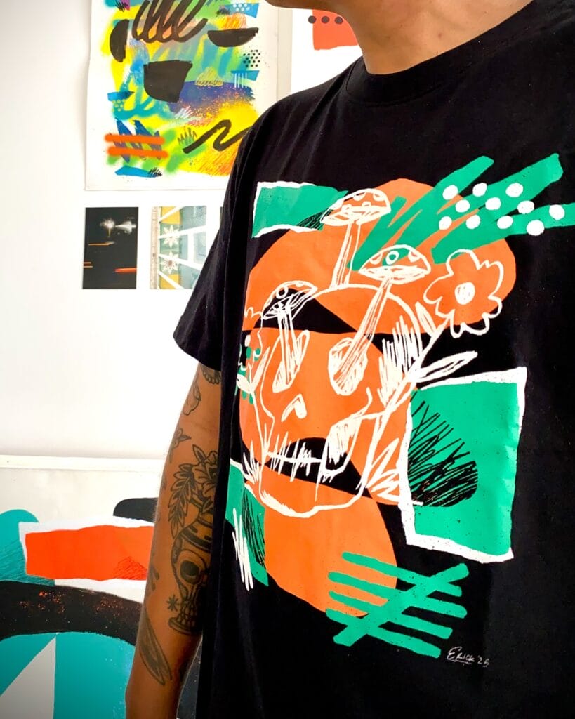
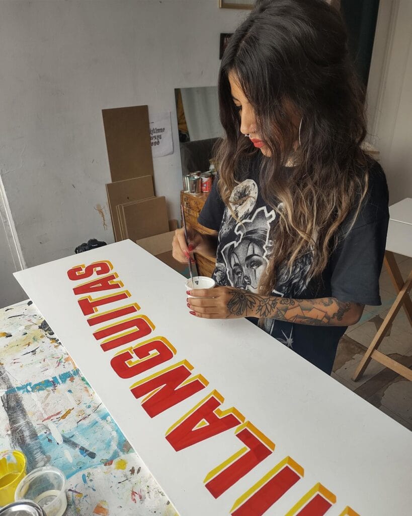
Calidoso’s path runs through the worlds of illustration, custom lettering, and screen printing. Early on, he gravitated to type-led graphics and emblematic marks—the kind of images made to be worn, shared, and seen at a distance. Over time he shaped a visual language of athletic cues, folkloric motifs, and sign-painting rhythms, translated into crisp vector forms and tactile print finishes. Today, his portfolio shows a steady throughline: letterforms first, then expressive symbols, all built for real-world reproduction on garments, posters, and products.
How He Works
Calidoso’s process moves from pencil roughs to clean vector systems, with custom lettering anchoring the composition. Palettes are intentional—limited enough to screen print cleanly, flexible enough to adapt across tees, hats, stickers, and patches. Texture and halftone are used sparingly for impact. Whether designing a logotype, an emblem, or a merch graphic, he prioritizes legibility, hierarchy, and “read” at multiple sizes. The result: artwork that feels handcrafted in origin but production-ready for apparel and print. You can see this pace in his reels and work-in-progress posts.
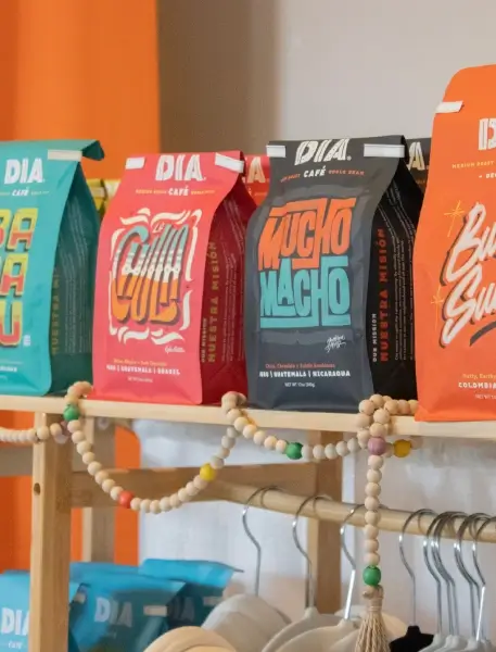
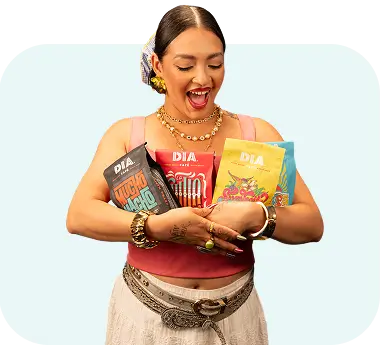
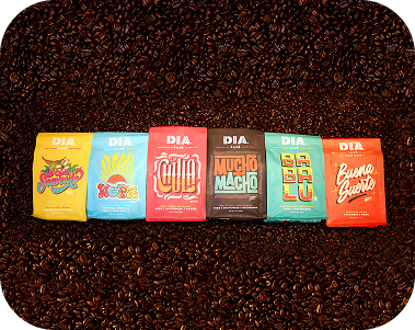
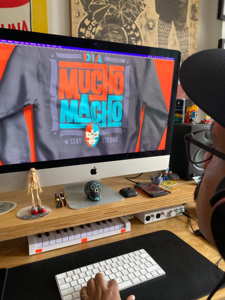
DIA × Calidoso: Merch Capsule
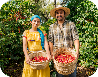
For DIA, Calidoso contributed merch designs that sync with the brand’s Latin-rooted coffee culture—bold letterforms, upbeat icons, and graphics built to live on soft goods. The pieces slot neatly into DIA’s shop alongside artist-led bag designs and limited drops: expressive, wearable graphics that carry the café’s voice into everyday life.
Selected Works & Highlights
- Type-first apparel graphics. Custom lettering, sporty emblem sets, and icon systems designed for screen printing and embroidery.
- Brand and product marks. Identity work distilled into marks with strong silhouettes and quick “read.”
- Print culture roots. Posters, patches, stickers, and limited-run drops—made to be collected and worn.
- Community-facing practice. Process shares and in-progress captures that show drawing, iteration, and make-ready steps.
Notes for Fellow Creatives (from Calidoso’s approach)
- Design for the medium. Build with print constraints in mind (color counts, stitch paths, halftones) so the piece hits on fabric, not just on screen.
- Lead with letters. Let typography set tone and pace; add icons and textures only where they support the read.
- Keep it wearable. Favor simple shapes, clear hierarchy, and balanced palettes—the stuff people want to put on again and again.
Quick Bio
- Discipline: Illustration, custom lettering, merch/apparel graphics, branding.
- Practice: Type-led compositions, emblem/icon systems, screen-print–ready artwork.
- Find Calidoso: Portfolio, process, and drops on his site and social channels.
- More feature context: Interview/profile and brand showcase.
Why We Partner with Latin Artists
DIA’s coffee is a cultural experience—told through origin, roast, and design. Collaborations like DIA × Calidoso bring that story to life in typography and iconography you can wear: bright, legible, and built for everyday use.
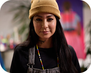
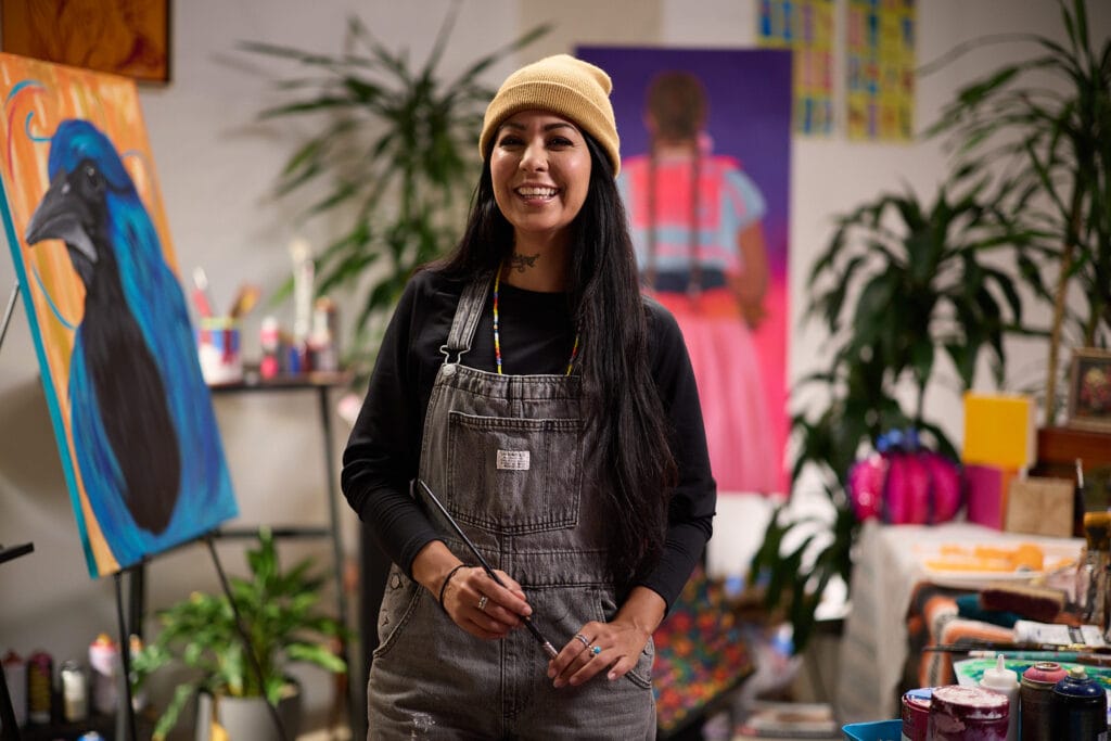
Erick "Calidoso" Ortega

Erick Ortega—known professionally as Calidoso—is a designer, illustrator, and lettering artist whose work blends bold type, hand-drawn iconography, and a deep love of print culture. His studio practice spans branding, apparel graphics, posters, and murals, with a look that’s equal parts street-savvy and craft-forward.

RELATED ARTICLES:
- Bringing Buena Suerte to Life: The Story Behind Michael Cerda’s Art for Dia Coffees
- Jackson Alves on Art, Coffee, and Creative Renewal in Phoenix
- La Morena x Dia Café: Rooted in Story, Raised by Art
- La Morena’s Real Talk: Advice for Struggling Artists Finding Their Voice
- Behind The Artist: La Morena
- Behind The Artist: Michael Cerda

SHOP RECIPE BLEND:

SEIZE THE DIA!
FOLLOW @DIACAFEWI